
Trust Bank
A one-week banking app concept exploring how layout, color, and hierarchy decisions shape the feeling of security.
Trust Bank
A one-week banking app concept exploring how layout, color, and hierarchy decisions shape the feeling of security.
Overview
Overview
Trust Bank is a self-initiated, one-week concept project. The question behind it was practical, not academic: when someone opens a banking app for the first time, they decide within seconds whether it feels safe enough to move their money through. I wanted to understand which design decisions drive that feeling — and design three screens around the answer.
Trust Bank is a self-initiated, one-week concept project. The question behind it was practical, not academic: when someone opens a banking app for the first time, they decide within seconds whether it feels safe enough to move their money through. I wanted to understand which design decisions drive that feeling — and design three screens around the answer.
This project aimed to create a concept design of the features that form the basis of a bank application in a short period of 1 week.
This project aimed to create a concept design of the features that form the basis of a bank application in a short period of 1 week.
Role
Role
Product Designer -
Solo Concept
Time
Time
2023
2023
Save
Trust Bank
Trust Bank
Trust Bank
It’s an app that provides health and adoption support to stray cats.
A one-week banking app concept exploring how layout, color, and hierarchy decisions shape the feeling of security.
It is a banking app that allows us to do internet banking.
Scope
Scope
Scope
One week is not enough time to design a full banking product, so I didn't try.
I scoped down to the three screens where the stakes are highest:
login, home, and spending. These are the screens where a user either builds confidence or quietly leaves.
Throughout the project, I aimed for success by following
"Double Diamond" principles.
Throughout the project, I aimed for success by following
"Double Diamond" principles.
Throughout the project,
I aimed for success by following "Double Diamond" principles.
The User Problem
The User Problem
The User Problem
Users switching to a new financial app carry a specific anxiety: "If something looks unfamiliar or messy, can I trust it with my money?"
Unlike e-commerce, where a weak interface costs you a sale, in banking it costs you the relationship before it starts. So the design target was clear: an interface that feels immediately familiar, calm, and in control.
Throughout the project, I aimed for success by following
"Double Diamond" principles.
Throughout the project, I aimed for success by following
"Double Diamond" principles.
Throughout the project,
I aimed for success by following "Double Diamond" principles.
Research: Evaluative, not Generative
Research: Evaluative, not Generative
Research: Evaluative, not Generative
With one week, I made a deliberate trade-off: instead of generative user research, I ran an evaluative benchmark of İşCep and Garanti BBVA — the two most widely used banking apps in Turkey — plus a review of 6 community concepts on Dribbble to map where convention ends and differentiation begins.
With one week, I made a deliberate trade-off: instead of generative user research, I ran an evaluative benchmark of İşCep and Garanti BBVA — the two most widely used banking apps in Turkey — plus a review of 6 community concepts on Dribbble to map where convention ends and differentiation begins.
With one week, I made a deliberate trade-off: instead of generative user research, I ran an evaluative benchmark of İşCep and Garanti BBVA — the two most widely used banking apps in Turkey — plus a review of 6 community concepts on Dribbble to map where convention ends and differentiation begins.
With one week, I made a deliberate trade-off: instead of generative user research, I ran an evaluative benchmark of İşCep and Garanti BBVA — the two most widely used banking apps in Turkey — plus a review of 6 community concepts on Dribbble to map where convention ends and differentiation begins.
Two patterns stood out across both banking apps:
Two patterns stood out across both banking apps:
The most frequent actions (transfer, QR, payments) are reachable before login.
Each screen shows only the minimum information needed — balance, recent activity — and hides everything else behind intent.
The most frequent actions (transfer, QR, payments) are reachable before login.
Each screen shows only the minimum information needed — balance, recent activity — and hides everything else behind intent.
İşCep — İş Bankası
İşCep is one of Turkey's most popular and widely used banking applications. Due to this, in this benchmark, I tried to understand their user-friendly approach.
İşCep — İş Bankası
İşCep is one of Turkey's most popular and widely used banking applications. Due to this, in this benchmark, I tried to understand their user-friendly approach.

İşCep — Login Screen
İşCep — Login Screen

İşCep — Home Screen
İşCep — Home Screen

İşCep — Spending Screen
İşCep — Spending Screen
Garanti BBVA — Garanti Bankası
Like İş Bankası, Garanti BBVA is another application with the most users in the sector.
Garanti BBVA — Garanti Bankası
Like İş Bankası, Garanti BBVA is another application with the most users in the sector.

Garanti — Login Screen
Garanti — Login Screen

Garanti — Home Screen
Garanti — Home Screen
Dribbble Shots
I reviewed 6 community concepts to see where designers break banking conventions — and what that costs in perceived trust.
Dribbble Shots
I reviewed 6 community concepts to see where designers break banking conventions — and what that costs in perceived trust.


The takeaway I designed around: in banking, removing information builds more trust than adding it.
The takeaway I designed around: in banking, removing information builds more trust than adding it.
The takeaway I designed around: in banking, removing information builds more trust than adding it.
Design Decisions
Design Decisions
Color
Color
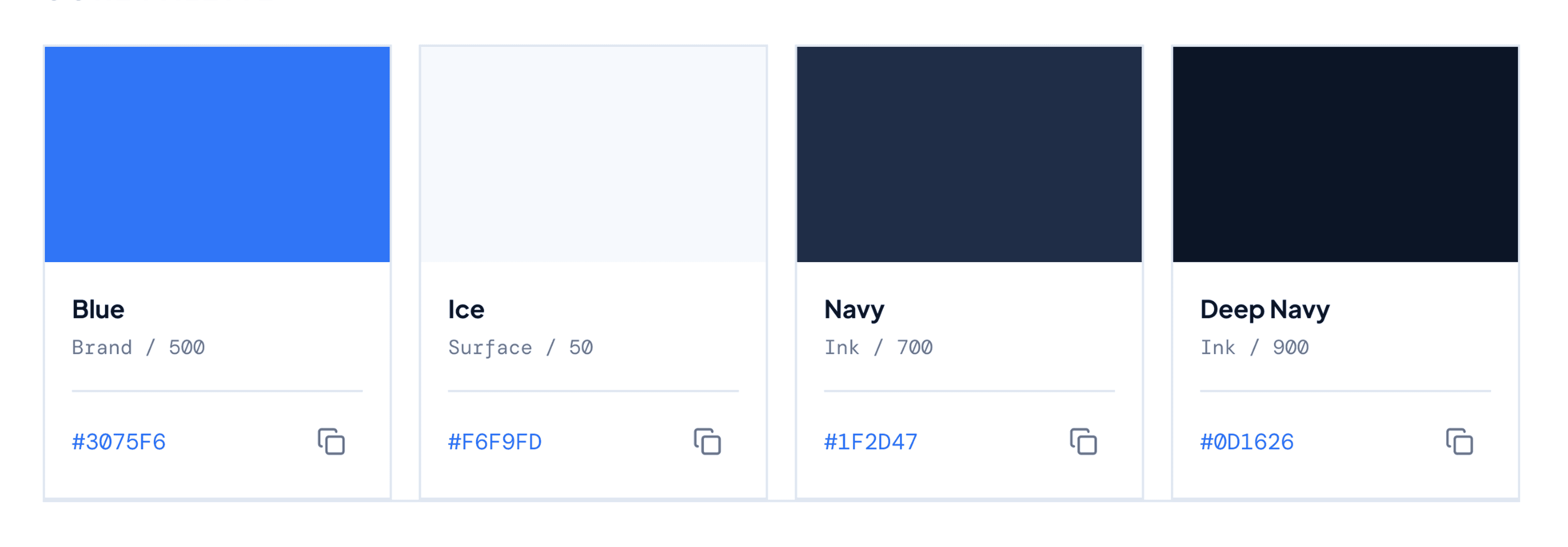
I chose blue as the primary color, but the reason matters more than the choice: blue is the category convention of established banks. In fintech, breaking convention costs you trust before it earns you differentiation — so I differentiated through layout and motion instead of color.
I chose blue as the primary color, but the reason matters more than the choice: blue is the category convention of established banks. In fintech, breaking convention costs you trust before it earns you differentiation — so I differentiated through layout and motion instead of color.
I chose blue as the primary color, but the reason matters more than the choice: blue is the category convention of established banks. In fintech, breaking convention costs you trust before it earns you differentiation — so I differentiated through layout and motion instead of color.
Typography and Grid
Typography and Grid
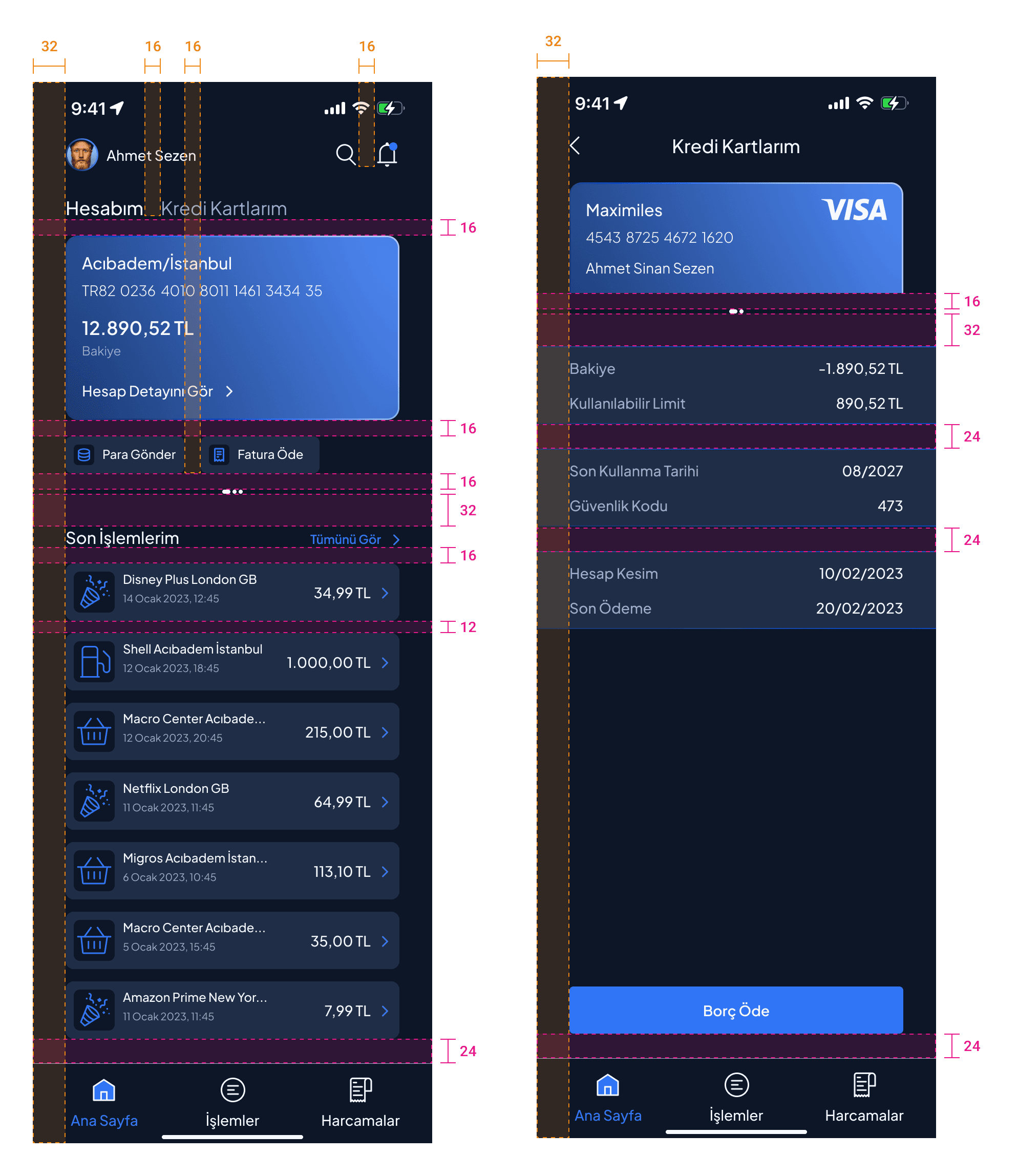
Plus Jakarta Sans on an 8-pt grid. Consistent spacing isn't an aesthetic preference here; irregular spacing reads as "unfinished," and unfinished reads as "unsafe" when money is on the screen. The grid also keeps developer handoff predictable.
Plus Jakarta Sans on an 8-pt grid. Consistent spacing isn't an aesthetic preference here; irregular spacing reads as "unfinished," and unfinished reads as "unsafe" when money is on the screen. The grid also keeps developer handoff predictable.
Plus Jakarta Sans on an 8-pt grid. Consistent spacing isn't an aesthetic preference here; irregular spacing reads as "unfinished," and unfinished reads as "unsafe" when money is on the screen. The grid also keeps developer handoff predictable.

Hierarchy Strips
Hierarchy Strips
Each screen follows the same order: state first (balance), actions second (transfer, pay), detail on demand. I documented this as hierarchy strips to make the layout logic explicit and testable rather than intuitive.
Each screen follows the same order: state first (balance), actions second (transfer, pay), detail on demand. I documented this as hierarchy strips to make the layout logic explicit and testable rather than intuitive.


Final Screens
Final Screens
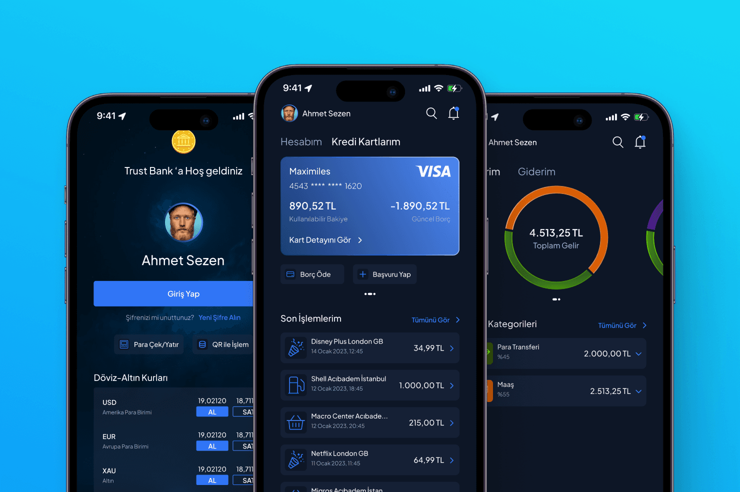
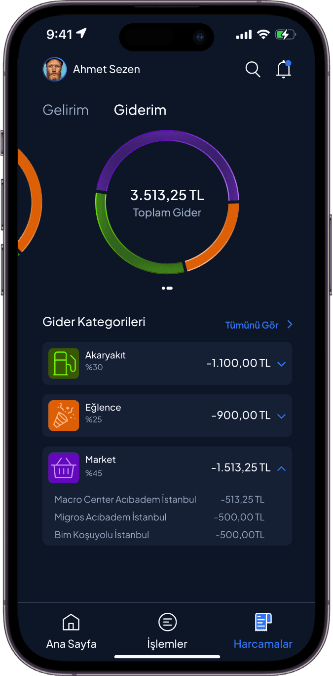
The final screens apply the three decisions above — category-convention color, systematic spacing, and state-first hierarchy. The goal was an interface a first-time user could mistake for a bank they already trust.
The final screens apply the three decisions above — category-convention color, systematic spacing, and state-first hierarchy. The goal was an interface a first-time user could mistake for a bank they already trust.


Validation
Validation
I tested the prototype with 3 participants in informal guerrilla sessions — no tasks, no direction, only one question: "How does this feel to use?"
I tested the prototype with 3 participants in informal guerrilla sessions — no tasks, no direction, only one question: "How does this feel to use?"
I tested the prototype with 3 participants in informal guerrilla sessions — no tasks, no direction, only one question: "How does this feel to use?"
3 out of 3 participants compared it to the banking apps they actively use, and 3 out of 3 described it as easy to understand. For a concept whose goal was category-convention trust, being mistaken for an established bank's app was exactly the pass condition.
3 out of 3 participants compared it to the banking apps they actively use, and 3 out of 3 described it as easy to understand. For a concept whose goal was category-convention trust, being mistaken for an established bank's app was exactly the pass condition.
3 out of 3 participants compared it to the banking apps they actively use, and 3 out of 3 described it as easy to understand. For a concept whose goal was category-convention trust, being mistaken for an established bank's app was exactly the pass condition.
What I'd Do Differently Today
Since this project, I've been working on enterprise-scale interfaces and design systems, and that changed how I'd run this sprint:
Since this project, I've been working on enterprise-scale interfaces and design systems, and that changed how I'd run this sprint:
Since this project, I've been working on enterprise-scale interfaces and design systems, and that changed how I'd run this sprint:
I'd build a small token-based component set first and derive screens from it, instead of designing screens directly.
I'd replace open-ended sessions with a 5-second test and a first-click test — trust perception is measurable, and 3 informal sessions can only suggest, not confirm.
I'd design the error and edge states before the happy path. In financial products, trust isn't defined by the screens where everything works — it's defined by what the product does when something goes wrong.
More Works
More Works
More Works